You know the feeling: you land on a website, and within moments you either think, “This looks legit, maybe I’ll scroll further” or “This screams amateur, I’m out”. As a founder of Nomad Founder, I’ve seen dozens of startups and small businesses lose good leads, not to price, not to product, but just because their header blew it. Your website header section is your handshake. And if it’s weak, you never get to the conversation. Remember, your website has 3 Seconds to Earn Trust.
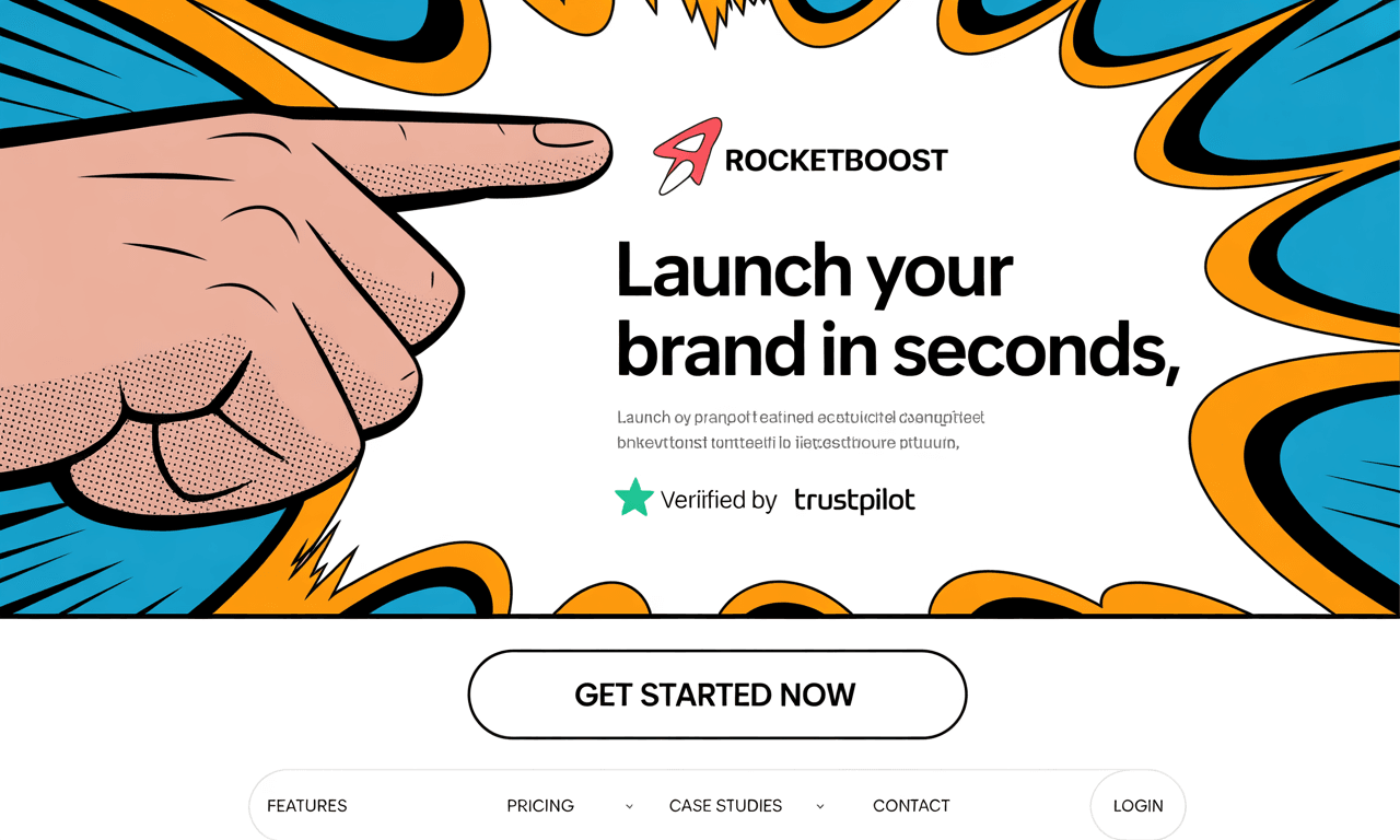
When I say “header,” I’m not talking about the technical <head> code or just the top navigation bar with links like Home, About, Contact. The header section is the first visible block at the very top of your website or landing page, the part users see before they scroll. It usually the section that contains your main headline and sub headline. It is also called the Hero section.
Here I’ll walk you through what neuroscience, design, and conversion data tell us about headers that build trust in three seconds or less. You’ll get a framework + actionable steps you can apply today.
This principle can be summed up in one crucial point: you have 3 Seconds to Earn Trust from your visitors.
Why those first seconds matter
- According to MIT research, the human brain can process a full image, even a complex scene, in as little as 13 milliseconds.
- That means people are making judgments almost instantly: “Am I in the right place? Is this trustworthy?”
- Add to that: studies of web behaviour show users don’t read, they scan. If your header doesn’t immediately reassure, clarify, or establish relevance, people bounce.
So yes: your header occupies the most valuable real estate on your site. It’s not just decoration. It’s a trust & conversion machine (or liability).
The 3-Second Trust Framework
Here’s a framework, four key elements every header must nail to pass the 3-second test.
| Element | What It Does | Key Indicators |
|---|---|---|
| Value Proposition / USP | Tells the visitor what you do, who you help, why you’re different. Avoid vague branding, jargon. | Headline + subheadline that answer: “What problem do you solve?” “Why with you?” First glance clarity. |
| Trust Signals | Proof (social proof, badges, clients, media, guarantees) that you are credible. | Logo of clients, “As featured in”, trust badges, testimonials. |
| Clear Primary CTA / Action | Guides the visitor: “What should I do next?” Without thinking. | A visible button/link (above the fold) e.g. “Talk to us”, “Get started”, “See pricing”, “Buy Now”. |
| Clarity + Load & Visual Design | Clean, fast, visually readable. No clutter. Mobile-friendly. | Fast load time, good contrast, minimal text, responsive design, non-generic stock images. |
You can think of this like an acronym: V T C C Value, Trust, Call to action, Clarity. If all four are solid, you’re much likelier to convert.
What “good” looks like in practice
Here are a couple of examples (some from my experience, some from clients) of headers that passed the 3-second test:
- A SaaS tool I worked with re-did their homepage header: bold headline “Build landing pages without code” (what), subheadline “…for marketers who hate waiting weeks” (who & problem), logos of clients under that (“trusted by X, Y, Z”), primary button “Try free 14 days”. Result: bounce rate dropped 25%, trial sign-ups rose ~30%.
- Another small business, a local services firm, had generic tagline + stock photo + contact info cluttered everywhere. We simplified to just: “We repair your AC today; emergency, licensed techs” + trust badge + phone number + “Book Now” as the CTA. Within a week, phone calls up by ~40%.
These are small fixes, but high leverage. If your header is bad, nothing that follows can fully compensate.
Applying this: Step-by-Step Fix Your Header
Here’s a mini-toolkit you can use this week with your website. I suggest implementing, testing, tweaking.
- Audit your current header in candidate eyes
- Show it to someone who doesn’t know your business (or a friend). Ask: “What do you think this business does? Would you trust them?”
- Time how long until they answer, if more than 3 seconds, there’s work.
- Define your core value / USP (if not clear already)
- What problem are you solving most urgently for your ideal customer?
- Why do they choose you over the alternatives?
- State that in simple, benefit-focused language. Avoid generic phrases like “best solution”, “innovative”, unless you immediately back them with what’s better.
- Gather trust signals
- Client logos, well-known partners.
- Testimonials (short, with name + photo if possible).
- Any certifications, awards, press mentions.
- Security/trust badges if relevant (especially for ecommerce).
- Design for clarity & speed
- Remove noise: extra menus, irrelevant promos above the fold.
- Mobile test: does the header still communicate well on small screens?
- Optimize visuals: compress images, use lightweight fonts, avoid slow scripts.
- Set a clear primary call to action (CTA)
- Button/text that tells someone exactly what to do.
- Position it prominently (top-right, or central).
- Use contrasting colour.
- Iterate based on data
- Use analytics (heatmaps, scroll maps) to see how people interact.
- A/B test headline versions, CTA text, trust badges.
- Monitor bounce rate on pages, time on site, conversion (whatever “action” you want: lead, trial, purchase).
Pitfalls & what not to do
I want you to avoid these mistakes I see too often:
- Jargon or vague language, visitors shouldn’t have to decode.
- Overloading with everything: “Hey we also do this, and this, and this…” every extra thing dilutes focus.
- Hidden/obscure navigation: people want to find “Pricing”, “About”, “Contact” easily.
- Slow loading: fancy visuals are useless if they take 5 seconds to load. You lost visitor long before they saw them.
- Ignoring mobile: what works on desktop can fail miserably on mobile.
Download the 3-Second Trust Builder guidebook here.
This 3-Second Trust Builder guide gives you
- Trust basics to win visitors fast
- The Trust Triangle: visuals, authority & competence
- Header optimization tips (headlines, images, CTAs)
- Smart design & layout ideas
- Color psychology made simple
- Mobile-friendly trust strategies
- Testing & improving over time
Download the 3-Second Trust Builder guidebook here.
Why this matters for first-time founders & small businesses
Because you don’t have infinite budget. Every click, every visitor is precious. You can’t outspend big competitors in awareness; but you can out-convert them by making your small front door (your website) extremely welcoming, crystal clear, and instantly credible.
Also: in early stage, trust is scarce. You probably don’t have tons of reviews yet, or huge clients. So you need to amplify what you do have is your promise, your clarity, your sincerity, in the first few moments.
Conclusion & Your Next Moves
If you do one thing this week: go fix your header.
- Evaluate your current header using the VTCC framework.
- Identify one obvious thing to improve (headline clarity? trust badge? faster load? better CTA?).
- Make the change. Push it live. Measure for a week.
- See how bounce rate, first-interaction metrics shift.
You’ll be surprised how often this one area unlocks growth without additional traffic.