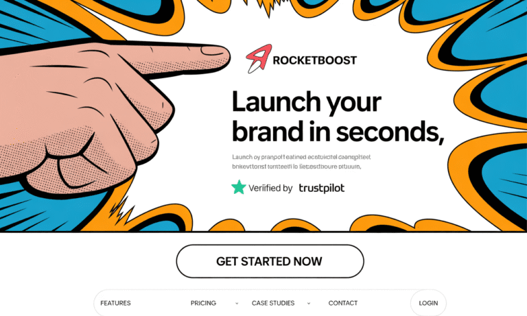
You know that moment when someone lands on your page, glances around, and clicks away before reading anything? That split-second (really, ~3 seconds) decision often hinges on visuals, not copy. If your images, layout, color, and “visual cues” are off, you lose trust, attention, maybe a customer. Visual Selling isn’t optional; it’s essential.
I’ve worked with first-time founders and small-business owners who thought “just make it look clean” was enough. It’s not. There are hardwired, psychological patterns behind how people see. Use them. They can give you an unfair edge.
In this article:
- I’ll walk you through the key visual triggers proven to drive conversions
- Back them with evidence, case examples, and “why this works”
- Give you a plug-and-play framework you can apply immediately
Let’s get into what works.
21 Visual Triggers That Transform Browsers Into Buyers
Here are visual techniques grounded in psychology; each one simple, effective, and inexpensive once you know what to look for.
1. The 3-Second Rule of Visual Impact
Visitors form an impression in under three seconds, and most of it is visual. That snap judgment determines whether they stay or leave.
Quick application: Make your headline and core benefit high-contrast. Test it: show someone your page for three seconds. If they don’t recall your offer, adjust layout or visuals.
Understanding Visual Selling can dramatically enhance your online presence and customer engagement.
2. Color Triggers: Urgency (Red), Trust (Blue)
Colors directly influence emotions. Red sparks urgency, while blue builds trust and calm. Aligning color to the buying stage can drive conversions.
Quick application: Use red for limited-time CTAs, blue for testimonials or credibility sections. A/B test button colors against your background.
3. The Golden Ratio / Proportion
Designs using the 1:1.618 ratio feel naturally harmonious. Our brains associate this balance with polish and quality.
Quick application: Resize product images or page sections to approximate the golden ratio. Even small tweaks increase perceived professionalism.
4. White Space as a Luxury Cue
Negative space directs focus and signals premium value. Less clutter reduces cognitive load and increases attention.
Quick application: Strip away non-essential elements around your headline and CTA. Give breathing room to benefits and key visuals.
5. Directional Cues That Guide Purchasing Paths
Eyes follow gazes, arrows, and implied lines. Guiding attention feels natural and persuasive without being pushy.
Quick application: Add a person’s gaze pointing toward your CTA, or arrows leading users from problem to solution to purchase.
6. Before-and-After Imagery
Transformation visuals help buyers picture the “after” state, reducing abstraction and building desire.
Quick application: Show clear before-and-after images—whether fitness results, cleaned rooms, or improved workflows.
7. Button Color Psychology
CTA buttons are decision moments. Bright, contrasting colors (orange, green) reduce hesitation and increase clicks.
Quick application: Run A/B tests with orange or green buttons versus your current color. Ensure strong contrast with the background.
8. Rule of Thirds in Photography
Placing subjects at 3×3 grid intersections draws natural attention. This feels balanced yet dynamic.
Quick application: Overlay a 3×3 grid on product or hero images. Position faces or features at intersection points.
9. Emotional Faces That Sell Without Words
Humans mirror expressions. Seeing joy or relief linked to your product triggers empathy and trust.
Quick application: Replace generic stock images with real people showing genuine emotion while using your product.
10. Pattern Interruption
Brains notice anomalies first. Breaking uniformity directs focus where you want it.
Quick application: In a grid, make one product larger, a different color, or at a different angle to highlight it.
11. Z-Pattern Layout
Western readers scan in a Z flow—top left, top right, diagonal down, bottom right. Aligning content here feels intuitive.
Quick application: Place your logo top left, highlight benefits along the diagonal, and CTA bottom right.
12. Yellow as a Spotlight Color
Yellow is the first color our eyes notice. It highlights effectively but creates anxiety if overused.
Quick application: Use yellow for small badges—“sale,” “new,” or highlights—rather than entire backgrounds.
13. Size Hierarchy
Bigger elements feel more important, naturally prioritizing attention without words.
Quick application: Enlarge your best-seller product image or feature by about 20% compared to others.
14. Green Effect on Purchase Confidence
Green signals safety, trust, and “go ahead.” It reduces anxiety during checkout.
Quick application: Add green check marks, trust icons, or progress bars in your checkout flow.
15. Imagery Gap: Desired vs Current State
Showing the contrast between “now” and “aspiration” motivates buyers to act. Your product becomes the bridge.
Quick application: Pair product images with aspirational lifestyle photos—show outcomes like freedom, fitness, or success.
16. Purple’s Premium Pricing Psychology
Purple historically represents royalty and exclusivity. It raises perceived value and justifies higher pricing.
Quick application: Add purple accents or packaging for premium or high-margin offerings.
17. Motion That Captures Without Distracting
Subtle animation boosts attention dramatically, while excessive motion irritates.
Quick application: Add hover effects on CTA buttons or smooth micro-animations. Avoid flashing or constant movement.
18. Rounded vs Angular Shapes
Shapes carry meaning. Rounded forms = safety and friendliness. Angular = precision and speed.
Quick application: Use rounded visuals for comfort-based products, angular ones for performance-based products.
19. Contextual Imagery That Sells Experiences
People buy experiences, not objects. Showing products in use helps them imagine ownership.
Quick application: Replace isolated product shots with lifestyle scenes where the product fits naturally.
20. The 60-30-10 Color Rule
Balanced color ratios prevent confusion and create harmony. 60% primary, 30% secondary, 10% accent.
Quick application: Audit your site’s color distribution. Ensure CTAs take up the 10% action share for maximum contrast.
21. Visual Anchoring / Decoy Effect
People decide by comparison. A decoy option makes your target offer appear as the best value.
Quick application: Present three options; basic, target, and premium decoy. Emphasize the target visually through size or color.
Why These Triggers Work: The Science Behind the Sales
- Snap judgments & subconscious processing: Research shows people form judgments about products or brands in 90 seconds or less, and much of that is visual.
- Cognitive load & clarity: White space, directional cues, hierarchy reduce cognitive overload. When people don’t have to think hard, they convert more.
- Emotion & trust: Colors, facial expressions, ambience feed into trust, motivation, and perception of value. E.g. blue brands tend to feel more reliable.
- Visual anchoring & comparison bias: Behavioral economics shows people make decisions comparatively. The presence of decoys, contrasting options shifts what “feels” reasonable.
The Visual Selling Framework: 3-Stage Toolkit for Founders
Here’s a simple way to implement these triggers without overwhelming yourself. Roll these out in phases:
| Stage | Goal | What to Implement This Week | Metrics to Track |
|---|---|---|---|
| Stage 1: Clarity & First Impression | Make first 3-seconds count | Ensure most important message (benefit) is high contrast & placed where eyes land; audit and clean up clutter; apply white space around headline & CTA | Bounce rate, scroll depth, what people remember when shown screenshot, heat maps |
| Stage 2: Trust Building & Emotional Connection | Reduce friction, increase trust | Add emotional faces or customer images; use color psychology (blue for credibility, green for safety, etc.); contextual imagery showing product in real life | Time on page, testimonial clicks, conversion rate for trust pages (about / social proof sections) |
| Stage 3: Decision Architecture & Conversion Triggering | Drive purchasing decisions | Apply decoy pricing; make CTA buttons standout via color/size; use motion subtly; use size hierarchy & pattern interruption; test directional cues | A/B test conversion rates (for checkout/buttons), average order value, drop-off rates in checkout funnel |
You don’t need to do all 21 at once. Pick 2–3 from each stage. Each tweak gives compounding benefit.
Case Example: Nomad Founder / My Clients
Here’s one I’ve seen work repeatedly:
- A founder selling online courses had a sales page with bland visuals, stock images, and default CTA color (grey/blue). We changed the CTA to bright orange, placed a testimonial photo of a real student with a strong emotional expression, added white space around the headline and CTA, and used a decoy “premium” package to make the standard package feel like value. Result: conversion rate jumped by ~35% in two weeks.
- Another small e-commerce store selling home decor items swapped out white-background product shots for lifestyle contexts (rooms, real homes), used pattern break on featured products, and applied the 60-30-10 color rule. Customer time on page rose and cart abandonment dropped notably.
These are simple, low-cost, high-ROI changes. That’s what small business should do.
Get the Visual Selling Guide Now
If you want to skip the trial-and-error and apply these visual triggers straight to your business, I’ve built a plug-and-play Visual Selling Guide for you. Inside, you’ll get clear direction on colors, fonts, and images, step-by-step tweaks for your product photos, and real-world examples that show how tiny changes can drive more clicks and sales. No design degree needed, just practical tools you can use today to start converting more customers tomorrow.
Get the Visual Selling Guide Now
Action Plan: What You Should Do This Week
Here’s what you do:
- Pick your 3 favorite triggers from the list above. (Don’t try all 21; depth beats breadth.)
- Apply them to your highest-traffic page: homepage, product page, or checkout.
- Measure before & after: conversion rate, bounce, scroll depth, impressions, etc. Use tools like Google Analytics, even simple heat maps.
- A/B test variations (e.g. orange vs green button; removed vs some white space) to validate changes.
- Iterate & add 2-3 more triggers next week, based on what’s working.
Conclusion
Here’s what I want you to take away:
- Visuals aren’t decoration. They’re part of the product. They speak before your words do.
- Small tweaks based on psychology can multiply results.
- You don’t need huge budgets, just clarity, consistency, and strategic attention to what your customer sees first.
If you want, I can share before-and-after story templates from founders I’ve worked with, if that helps your implementation.

