If you’re a first-time founder or small business owner, this might sound familiar:
- You’ve built a sleek site, great product, maybe even driven traffic with ads… but still, people don’t buy as much as you think they should.
- You tweak pricing or features but see only tiny lifts.
- You wonder, “Is it me, is it the offer, or is it something deeper?”
What I want you to walk away believing: most underperforming conversions aren’t about lack of features, or competitors having more money. They’re about missing psychology. Understanding how people decide, not just what you decided to build, can unlock big gains, with relatively low spend or complexity.
Because I’ve been there burning campaign budget, watching cart abandonment, seeing enthusiasm fade. The difference between a site that merely works and one that converts well is in how it respects human decision-making.
Here’s a guide to what conversion psychology really means, proven ways to apply it, and a tactical framework you can start using today to stop losing potential customers at invisible friction points.
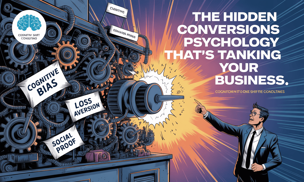
What is Conversions Psychology, and Why It Matters?
Conversions Psychology is the study of how people make decisions: what mental shortcuts (biases), emotional levers, social cues, and environmental signals push someone toward “Yes, I’ll buy” rather than “Maybe later.” Understanding Conversions Psychology can significantly enhance your marketing strategies.
When you ignore those, you build friction without knowing, unclear messaging, weak offers, missing trust signals, generic experience. When you lean into them, you guide people, reduce hesitation, help them feel safe, urgent, or excited.
Some evidence:
- A 2022 study “Developing a conversion rate optimization framework for digital retailers” found that behavior-based touchpoints (e.g. cart-abandonment signals, visual cues) when acted on increase sales significantly.
- Case studies across e-commerce show that adding urgency or showing stock scarcity (“only 3 left”) can drive conversion lift of several points (e.g. AB-Tasty’s examples: SushiShop saw +3% in cart confirmations by adding urgency messaging).
Key Psychological Principles Every Founder Needs to Master
Here are the levers I’ve found most powerful. Use them mindfully.
1. Anchoring
First price or option seen sets a benchmark in a buyer’s mind. Subsequent prices are judged against it.
How To Use It (Tactics)
Show a premium option first. Display original price vs discount. Use “high anchor” to make your regular offer feel more valuable.
2. Loss Aversion
People tend to feel losses more than gains of the same size. The fear of losing something motivates more than promise of gaining.
How To Use It (Tactics)
Frame missed benefits: “Don’t lose your chance to ____”, show what they’ll miss. Also urgency/scarcity tie into this.
3. Social Proof / Authority
We look to others when uncertain. Testimonials, reviews, user counts, endorsements lower risk.
How To Use It (Tactics)
Use customer stories, expert quotes, numbers (“X users”, “Y satisfied customers”). Fresh is better than old. If possible, show proof relevant to the visitor (region, problem).
4. Scarcity & Urgency
Making something limited (time, stock, access) creates FOMO, pushes people off “just thinking about it”.
How To Use It (Tactics)
Limited-time offers, stock counters (“Only 2 left”), exclusive access, timed bonuses. But ensure honesty and don’t overuse.
5. Trust & Transparency
If people don’t trust you, small objections become big ones. They need signals that feel real.
How To Use It (Tactics)
Display clear return policies, security badges, contact info, guarantee. Use real photos, avoid over-polished falseness. Also respond to negative reviews well.
6. Value Proposition Clarity
If your visitor can’t immediately see: who you help, how, why you’re different, they bounce.
How To Use It (Tactics)
Write simple statements (“For X who want Y, we do Z unlike competitors …”). Put it above the fold. Test different messaging.
7. Personalization
People convert when they feel seen. “This feels made for me” lowers barrier to buy.
How To Use It (Tactics)
Use behavior, location, past interactions. Segment your messaging. Use dynamic content. Customize CTAs.
A Practical Conversion Psychology Playbook for Small Businesses
Here’s something you can plug into your operations, a 6-step repeatable loop you run every few weeks. Doable even if you’re lean.
- Persona & Bias Mapping
- Revisit your ideal customer: fears, desires, What’s stopping them right now.
- For each persona, choose 2 cognitive biases or emotional triggers that likely matter most (loss aversion, social proof, etc.).
- Messaging & Offer Audit
- Take your current home page / product page / biggest traffic pages. Evaluate: is your value proposition crystal clear? Are you using anchors, loss framing?
- Identify weak spots: confusing headlines, bland offers, missing trust signals ? list 3 improvements.
- Design & Layout Check
- Is your most important message and CTA in the “primary optical area” (top left)? Are CTAs visible and compelling? Is there enough whitespace so nothing feels cluttered?
- Colors & fonts: Do they align with emotion you want (trust vs urgency vs calm)?
- Social Proof & Trust Builds
- List all forms of social proof you have (testimonials, case studies, certifications).
- Add or refresh at least one new type this week. If you don’t have video reviews, maybe get one; update older reviews.
- Urgency / Scarcity Lean-ins
- Evaluate where you can introduce honest urgency: limited-time deals, stock count, early-access.
- Test one urgency tactic in a campaign. Measure lift.
- Test, Measure, Iterate
- Use A/B or split tests (messaging, CTA text, layout).
- Track key metrics: conversion rate, bounce rate, time on page, average order value.
- Use heatmaps / session recording to see where people hesitate or drop off.
Repeat the toolkit every 2-4 weeks to refine what works for your audience.
Download the Psychology of Conversions Guide now
If you want to turn browsers into buyers without guessing games, I’ve put together a resource that does exactly that. Inside this Psychology of Conversions Guide, you’ll find: a complete roadmap to using psychology for better conversions and customer engagement, easy steps for applying emotional triggers, tips to create urgency and scarcity that drive faster purchases, simple techniques for building trust through social proof, and proven methods for designing websites and content that turn visitors into loyal customers. Don’t let small tweaks you could make today keep costing you sales tomorrow. Get the guide and start applying these strategies immediately.
Download the Psychology of Conversions Guide now
Three Real Examples & What They Did Right
- Booking.com uses urgency + social proof heavily: they show how many people booked recently, how few rooms are left. It pushes people to act instead of delaying.
- OnePlus (early days): invite-only launches. Scarcity + belonging + hype. That exclusivity made people feel special, created anticipation.
- SushiShop: placed a sticky banner in their mobile app during lunch hours asking users to pre-order to guarantee timely delivery. Result: ~3% gain in cart confirmations. Small change, decent impact.
These examples show the point: you don’t always need a huge budget. Clever framing + small signal changes = measurable wins.
Common Mistakes Founders Make, So You Don’t
- Using urgency or scarcity dishonestly (false deadlines, misleading stock) ? damages trust long-term.
- Overloading pages with too many CTAs, colors, distractions ? decision paralysis.
- Ignoring mobile UX: what works on desktop often breaks on small screens.
- Assuming what “sounds good” internally will resonate, skipping tests or ignoring real user feedback.
- Letting social proof go stale (old testimonials, overly vague statements).
Action Steps You Can Take Today
If you implement only three things this week, do these:
- Rewrite your headline + value proposition using the formula: For [target audience] who [problem], our is [category] that [key benefit]. Unlike [competitor], we [primary differentiation].
- Add one urgency or scarcity element somewhere you already have traffic (homepage, product page, checkout): either “Only X seats left”, “Offer ends in 24h”, or a limited-stock indicator. Measure change.
- Boost social proof: get / refresh one customer testimonial (bonus if with photo + concrete metric), or show count of users/customers. Make it visible near your CTA.

Conclusion
Conversion isn’t a mystery, it’s psychology + design + iteration. If you treat the human decision-making process as central (not secondary to features or visuals), you’ll stop leaking revenue, wasted traffic, and frustration.
You don’t need a massive budget. You need to test, observe, evolve.
If you apply these ideas, anchoring, urgency, social proof, clarity, personalization, you’ll begin seeing improvements. Probably small at first, but compounding over time, they stack into real growth.
Reflective CTA
What’s one part of your site (or offer) you feel most unsure about, messaging, urgency, trust, layout? Pick that, apply one psychological lever from above, run a test in the next two weeks. Send me what you tried & what you saw. I want to hear your wins or surprises, because I believe getting this right is one of the biggest leverage points for first-time founders.