Intro: You’re probably losing money, and you don’t even know it
Hey founder friends, this one’s personal. When I started Nomad Founder, I assumed “design stuff” was for agencies, not me. Colour? Just pick what looks nice, right? Wrong.
Here’s the brutal truth: your colour palette is silently working for you or against you. It shapes first impressions, trust, clarity, even whether someone clicks “buy now.” And yes, wrong colours can cost real business, not just aesthetic shame. These are the Color Mistakes that can harm your sales.
If you’ve ever wondered why your website feels bland, your conversion rates stay stuck, or your brand just doesn’t feel memorable, you might be falling into one (or more) of these colour traps. Let’s expose 13 colour blunders, or Color Mistakes, I see too often, and more importantly, how you can fix them fast. I guarantee: with some tweaks, you’ll see results in weeks, not months.
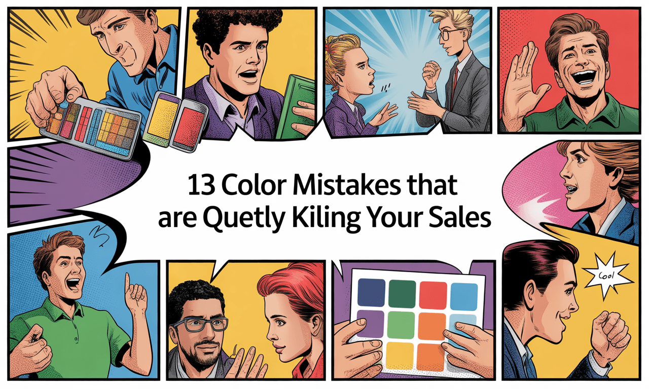
13 Color Blunders & How They Cost You
Below are common mistakes I see founders make, how each one hurts your bottom line, and what you must do instead.
1. Random Colors Without Strategy
- How it hurts:
- Creates low recognition.
- Customers don’t remember inconsistent brands.
- Recognition ? builds trust ? builds sales.
- What to fix:
- Define your brand personality in 3 words (e.g., reliable, bold, approachable).
- Pick 2–3 primary colours + 1–2 accent colours.
- Create a one-page style guide with exact codes and share it with your team.
2. Ignoring Industry Conventions
- How it hurts:
- Customers question your legitimacy.
- Straying too far raises doubt and lowers conversions.
- What to fix:
- Study the top 3–5 competitors’ palettes.
- Note the psychological associations behind colours.
- Find balance: align enough to feel credible, but differentiate enough to stand out.
3. Overlooking Cultural Associations
- How it hurts:
- Colours mean different things in different regions (red = prosperity in China, danger in the US).
- Misalignment can alienate entire markets.
- What to fix:
- Research cultural meanings before entering new markets.
- Create region-specific colour variants if necessary.
- Consult local experts to avoid costly mistakes.
4. Poor Contrast / Accessibility Issues
- How it hurts:
- Low-contrast text is unreadable, leading visitors to bounce.
- Frustrated customers don’t convert.
- What to fix:
- Use contrast checkers.
- Follow WCAG standards: ~4.5:1 for normal text, ~3:1 for large text.
- Offer high-contrast display options.
5. Emotional Mismatch: Colours vs Brand Message
- How it hurts:
- If colours contradict your promise, trust erodes.
- Conversions can drop by double digits.
- What to fix:
- Define your emotional promise: how do you want customers to feel?
- Match colours to emotions:
- Blue ? trust.
- Red ? urgency/excitement.
- Green ? health/wellness.
6. Too Many Colours Overwhelm Customers
- How it hurts:
- Creates visual noise and cognitive overload.
- People leave before buying.
- What to fix:
- Limit your palette to 3–5 colours (including neutrals).
- Apply the 60-30-10 rule: 60% primary, 30% secondary, 10% accent.
7. Neglecting Colour in CTA Elements
- How it hurts:
- Blended CTAs don’t get clicks.
- You hide the very path to purchase.
- What to fix:
- Use a colour that strongly contrasts with your main palette.
- A/B test different button colours.
- Design a clear visual hierarchy guiding users to take action.
8. Inconsistent Colour Use Across Platforms
- How it hurts:
- Website blue ? packaging blue ? ad blue = sloppy look.
- Recognition drops; trust suffers.
- What to fix:
- Document exact colour values (HEX, RGB, Pantone, CMYK).
- Maintain a brand style guide.
- Audit every quarter for consistency.
9. Ignoring Colour Psychology in Pricing & Promotions
- How it hurts:
- Price presentation affects value perception.
- Wrong colours reduce urgency or dilute premium feel.
- What to fix:
- Use red/orange for discounts and urgency.
- Use black, dark blue, or brand-aligned tones for premium items.
- Be intentional with every price display.
10. Fading Into the Background (Too “Safe”)
- How it hurts:
- You look like every other competitor.
- Forgettable branding = fewer repeat buyers.
- What to fix:
- Map competitor palettes.
- Claim an underused colour or combo.
- Be bold—own a distinctive hue.
11. Dated Colour Schemes
- How it hurts:
- Outdated palettes signal your products are outdated too.
- Perceived value drops.
- What to fix:
- Audit your palette every 2–3 years.
- Refresh without losing your core identity.
- Look at Apple/Google: subtle refreshes keep them modern without erasing recognition.
12. Disregarding Gender (and Audience) Preferences
- How it hurts:
- Ignoring proven preferences reduces appeal.
- Not about stereotypes, but about segment data.
- What to fix:
- Study your primary audience composition.
- Build product/marketing variants for major segments.
- Test colour performance by audience group.
13. Improper Colour Balance & Visual Weight
- How it hurts:
- Bad balance creates subconscious tension.
- Engagement time shortens; trust drops.
- What to fix:
- Apply the 60-30-10 rule consistently.
- Use whitespace for breathing room.
- Remember darker colours feel “heavier”—use sparingly or strategically.
- Test different distributions on key pages and track results.
What the Research Actually Shows
To give these claims more weight, here are real findings that back this up:
- Colour increases brand recognition by up to 80% when used consistently.
- First impressions are largely visual: some studies suggest 90% of snap judgments about products are based on colour alone.
- Emotional responses to colours follow patterns: blue often signals trust, green health/growth, red urgency/excitement.
- Poor contrast hurts engagement drastically. Very low contrast “designer-trendy” palettes are now being shown to reduce form completions, increase bounce rates.
Strategy + Framework: Fix Your Colours Fast Toolkit
Here’s a plug-and-play framework you can run through this week to repair or build your colour strategy.
Colour Strategy Checklist
| Step | What to Do | Why It Matters |
|---|---|---|
| 1. Define your core emotional promise & brand personality | Answer: What do I want customers to feel? 3 words for brand personality. | Sets direction. Ensures colours align with message. |
| 2. Audit current colours | Collect all touchpoints (website, packaging, social, app, etc.). Note colours/shades in each. | Find inconsistencies, places doing harm. |
| 3. Research your industry & audience | Competitors colours. Cultural colour meaning in target regions. Audience demographic preferences. | Helps avoid distrust; helps differentiate safely. |
| 4. Build your palette | Choose primary + secondary + accent + neutral(s). Use 60-30-10 as a guide. | Keeps visuals coherent, reduces overwhelm. |
| 5. Test CTA & pricing colours | A/B test buttons, pricing tags, discount graphics with different contrasting colours. | Small change; big wins if you pick right. |
| 6. Check contrast / accessibility | Use tools (Colour Safe, WCAG checkers). Ensure text readability. | More audience can access; legal & ethical win. |
| 7. Maintain consistency | Create style guide with exact codes. Share with everyone. Quarterly audits. | Builds recognition ? trust ? better metrics. |
| 8. Refresh periodically | Every couple of years, review trends / what feels dated. Evolve without losing identity. | Keeps brand feeling alive, not stuck in past. |
Case Example: A Quick Win
When I coached a small e-commerce founder last quarter, they had a website where the “Buy Now” button was a muted blue, almost same shade as the header bar. Clicks were low. We changed it to a high-contrast orange (accent colour) that popped against background. Within 14 days, the CTR on that button jumped ~28%. Not because the product changed; just the colour.
That’s proof: sometimes it’s not what you sell, it’s how you show what you sell.
Conclusion
Colour is not “just design.” Especially for first-time founders, it’s one of the highest-leverage things you can fix. You don’t need a full rebrand to start seeing returns; you need intention, strategy, and smart tweaks.
Here’s your action plan this week:
- Do a quick audit of your top customer-touchpoint (likely website or marketing email).
- Identify one colour blunder from the list above that stands out most.
- Fix it (e.g. adjust CTA colour, improve contrast, simplify your palette).
- Measure (before/after) to see what changed in clicks, conversions, engagement.
If you do just that, your numbers will start moving. And you’ll feel more confident in your brand identity.
CTA
I’d love to hear: Which of these colour mistakes have you made (or maybe are making right now)? Post in the comments, DM me, or reply to this post. Let’s diagnose together, because small fixes add up fast.